ORACLE UX INTERNSHIP
Timeline: 12 weeks, Summer 2023 Role: UX Design Intern Tools: Figma, FigJam
I worked as a UX Design intern on Oracle's Global Business Units (GBU) User Experience Central team during the summer of 2023. The Central team supports the overall UX effort across all 10 of Oracle’s Global Business Units. Throughout my time, I worked on three different teams within the Central team—research, consulting, and design ops. On each team, I went through steps of Oracle’s Redwood design process. I worked alongside another UX Design intern, Rebecca Yee.
CONTEXT
Redesigning a vital tool.
Rebecca, my co-designer, and I were tasked with redesigning the Redwood Project Inventory, a tool that monitors the uptake and progress of Redwood design projects across Oracle’s Global Business Units (GBUs). Each GBU has a UX Lead and manages its own projects, and some teams are further along in implementing the Redwood user experience than others. The GBU UX Central team needs to support the GBUs as they adopt Redwood, and the Redwood Project Inventory is meant to facilitate this by allowing Central Team Leadership to see what teams are working on, the progress of projects, insights, and more.
DISCOVERY
From stakeholder and user interviews, we defined two distinct user groups.

FigJam file where we generated interview questions
We spent time generating thoughtful questions for our stakeholders in order to kick off the project—these interviews helped us to identify business requirements, goals, and additional users to interview. We conducted interviews over the course of two weeks, constantly adjusting our questions and analyzing the outcomes of each conversation. We were able to identify two distinct user groups involved in the platform.
( 1 ) Users Inputting Data — GBU UX Leads
-
The UX Leads of each GBU are responsible for inputting data about their GBU’s projects.
( 2 ) Users Monitoring Data and Producing Reports — UX Central Team Leadership
-
UX Central Team Leadership members are mainly responsible for monitoring the data within the Redwood Project Inventory and using this data to produce reports on the overall GBU progress with implementing Redwood.
How can we find a balance between these two user groups and their different goals in order to design a more effective tool?
DEFINE
The Redwood Project Inventory is meant to help leadership track projects, but the data is often inaccurate or not up-to-date.
We synthesized the results of our interviews in order to define pain points, user goals, and what success would look like for our project. A few high-level issues we identified with the platform include the following:
( 1 ) Inputting data is inconvenient for GBU UX Leads, so it is difficult to get them to engage with the platform.
( 2 ) The Central UX team is forced to add projects on behalf of the UX Leads, which becomes a tedious process where some assumptions must be made.
( 3 ) Data inaccuracy in the platform.
( 4 ) Multiple platforms are used during the process. Design reviews, which the GBU UX teams complete with members of the UX Central team, are inconveniently tracked in a separate platform.
SUCCESS CRITERIA
What does success look like for our two user groups?
Using synthesis from our interviews aided by thorough discussion with our stakeholders, we began to define success for the project.

( 1 ) UX leads barely engage with the inventory due to its inconvenience, they believe they don't gain much from it and want to focus on other tasks. This means the Redwood Project Inventory often does not have accurate data. More frequent engagement with the Redwood Project Inventory means more accurate data and also makes the input process easier because there are less updates to make.

( 2 ) Currently, UX Central Leadership engages with the Redwood Project Inventory less frequently due to distrust in the data. Ideally, they would like to always have the platform open in the background so they can quickly glance and see how Redwood projects are doing across the GBUs.

( 3 ) This is currently a tedious and time-consuming process. We aimed to eliminate most of the activities involved in this process:
-
Contacting UX Leads over Slack to confirm data
-
Waiting for UX Leads to respond
-
Manually updating the data in an excel spreadsheet
-
Compiling data into a presentation to be sent to higher GBU leadership

( 4 ) The process of adding a project is time consuming and confusing due to a number or factors. During usability testing, UX Leads were slow to input information due to confusion with field labels, abbreviations, and answer choices. The UX Lead is forced to put down information that they feels unsure about, leading to questionable data
USER GOALS
Throughout the end-to-end design process, we constantly looked back at and refined our user goals.
We consolidated our findings from our interviews for our two user groups and created personas with goals to guide the rest of the design process.
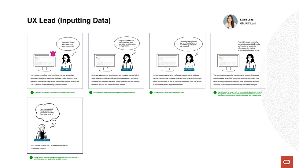
Lizzie the UX Lead — Inputting Data
As a UX Lead, Lizzie manages a team of designers and is constantly advocating for good UX. She primarily monitors the status of her GBU's projects in her own Confluence page.

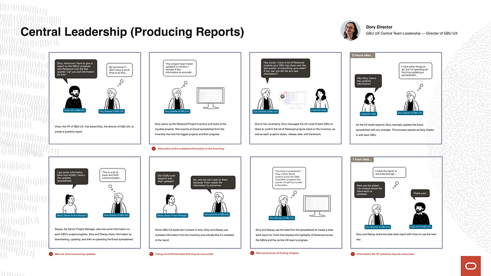
Dory the Director — Monitoring Data and Producing Reports
Dory is the director of the GBU UX Central Team. She helps other GBUs with their projects by providing support, resources, and strategy. At the end of each quarter she downloads all of the data in the Redwood Project Inventory, cleans the data, and creates a report to distribute to higher GBU leadership, such as the Vice President of GBU UX Design.

Current State to Desired Future State.
We then took time to visualize the current process with the inventory through storyboarding, making sure to define all of our users’ pain points. Using our storyboard of the current state, we then contrasted it with a detailed storyboard of a potential future state. Our future state script was a way to reach for the north star and demonstrate an ideal use of the platform.
Using our future scripts to map out our solution and address pain points
In order to include detailed solutions in our future scripts, we needed to start ideating while keeping our user goals in mind. While brainstorming, I focused on addressing these questions:
How might we encourage engagement from UX Leads and add perceived value?
How might we eliminate the manual back and forth process between our two user groups?
How might we give UX Central team leadership an effective overview of all the information they want to see?
Ideation
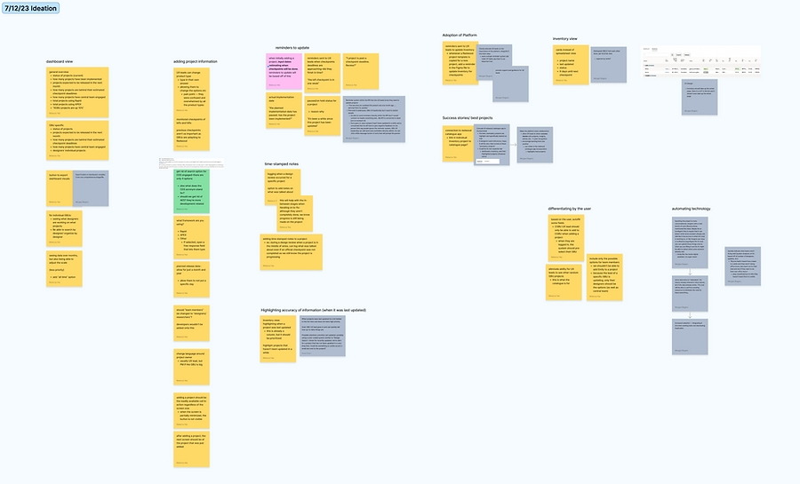
FigJam file where we ideated separately and then discussed our ideas together
Central Leadership's Current and Future States
Pain Points
( 1 ) Data — Dory manually updates date in an excel spreadsheet
( 2 ) Reminders — Dory manually checks in with GBU UX Leads to confirm project information
( 3 ) Insights — Dory manually calculates insights within the excel spreadsheet
( 4 ) Reports — Dory manually converts spreadsheet data into visuals for a PowerPoint
( 5 ) Data Accuracy — Dory has low confidence in the accuracy of the data she gathers
Every part of the process is manual and time-consuming

GBU UX Leads' Current and Future States

Pain Points
( 1 ) Frequency— Lizzie only updates the inventory 2-3 times a year when she is prompted to by central leadership
( 2 ) Input — It takes Lizzie at least 10 minutes to add one project
( 3 ) Relevancy — Lizzie feels this process takes time away from her other responsibilities
( 4 ) Checkpoints— Lizzie is required to update 4 Redwood design process checkpoints
The process is inconvenient and confusing
DESIGN
Concepting: Translating our future scripts into designs.
With all of our pain points addressed and an ideal version of the platform mapped out, we further pushed our ideas while creating user flows and wireframes. We decided to divide the platform into two separate views, so that it would be customized for each user group and their different needs. The current Redwood Project Inventory is the same no matter who is viewing it, despite their different roles. We scheduled frequent meetings with team members as well as our stakeholders during this time and iterated for a few weeks on our wires. Below are some of our user flows and some of the design decisions we made.
Highlighted User Flows


Note: Due to Oracle’s NDA policy, I am unable to show our high-fidelity designs. The following images have been modified to comply with the guidelines.
( 1 ) Ease of adding projects: conversational form with autofill capabilities
UX leads struggle while adding and updating information and our goal is to increase their confidence. With usability testing, we were able to identify all points of confusion during the input process and adjusted the form accordingly. Currently, the process also feels redundant because they are simply re-entering information about their projects in another platform, when they already keep everything in a source of their own. We added the ability to upload an external tracking tool (A Confluence page is one example of a source a UX Lead may use to manage their projects). After inputting the project’s name, the system is able to pull relevant information from the source and autofill some details. This makes the experience feel less repetitive and frustrating to our UX Leads, and decreases the amount of time spent manually searching for the information in their sources. We also spent time reworking the language within the form to make it feel more conversational and less confusing.

( 2 ) Keeping teams on track: design reviews
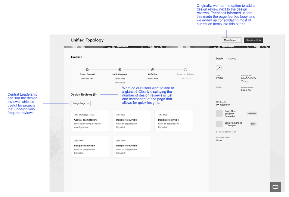
Design reviews are the only way to ensure teams are making progress and receiving necessary feedback, so it is a priority for Central Leadership to be able to track the cadence of design reviews. Currently, Central Leadership must manually check with members of their team or look to their external Confluence page to understand what design reviews have been completed. I also observed that in the current solution, Central Leadership was using small notes sections to randomly write down dates of design reviews along with other brief comments—a process that is neither sustainable or efficient. To address this issue, we incorporated design reviews into the platform and added the ability to request a design review directly within the platform.
Request a Design Review — Early Iteration
Initially, we added the ability to request a review directly on the project page, along with a variety of other action items. We realized this was an inefficient way to request a review though, because Central Leadership would have to manually click into each project. We further developed the design with the goal of allowing Central Leadership to easily see what projects need design reviews across all of the GBUs.

Request a Design Review — Final Design
We completely moved the feature to a different page—Central Leadership can now filter the inventory and see what projects have not received a design review in 2 or more weeks. This allows them to instantly know what project teams need to be checked in with, rather than manually sorting through the inventory or asking team members. They can then click a button to send a design review request to all of the project owners.

Add a Design Review Final Design
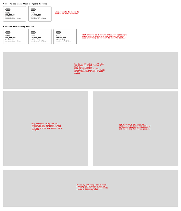
( 3 ) Project management: project timeline, reminders, and deadlines
In order to make the platform feel more relevant to UX Leads and increase engagement, we thought about how we could help them to manage their projects and provide more valuable insights. We redesigned both the dashboard view and the project page for this user group.
Project Page — Iterations
In order to provide more benefit to UX Leads and incorporate it into their workflow, while also lessening the need for Central Leadership to send reminders, we added the ability to input checkpoint deadlines while adding a project. These deadlines are incorporated into a project timeline that the system will remind UX Leads about to help them stay on top of their projects.

As we made changes and received feedback, we made sure to constantly connect back to our user goals, and I asked myself questions such as: What is the most valuable information that our user wants to see? What do they want to gain at a glance? How can we seamlessly incorporate design reviews? We made more than10 iterations of this one page. As we received feedback from different people, and heard dozens of suggestions, I learned that it was important to understand how to filter and internalize feedback for it to be the most effective.
Project Page — Final Design

Dashboard — Iterations
Currently, the same dashboard visualizations are displayed for both Central Leadership and UX Leads, but the high-level overview of projects is only useful to Central Leadership—UX Leads only care about what’s happening within their own GBU.
We would start our wires with low-fidelity sections paired with questions. We would write these questions from the perspective of our users so that we could align the design with their needs.
We realized while receiving feedback we hadn’t exactly incorporated our shape of data into this page—UX Leads typically only have around 5 projects going on at a time.
Rather than placing small cards on the screen alerting them of deadlines, it would be more useful to emphasize all of the projects in one view, and show the deadlines within the item.


Dashboard — Final Design

So many decisions!
Above are just a few of many decisions we made throughout the design process. Along with the major design decisions we made, there were dozens of minor details, but each detail had a lot of thought behind it. Why did we put the timeline at the top of the project page? Why did we add this one filter chip? Why did we add small text that states how many days ago an update was made? Why didn't we add even more data insights on the UX Lead's dashboard? Why did we move the navigation to the bottom of the page? I learned how important it was to constantly ask why and to connect every small detail back to our user goals. Sometimes when seeking feedback, my mentor would answer all of my questions with, "Well, what do your user goals say?"
SOME lEARNINGS AND TAKEAWAYS
I kept a weekly journal to reflect on what I learned, struggled with, and overcame.
( 1 ) Filter feedback and provide detailed context — We actively sought feedback but noticed that at times, it didn't align with our goals. To address this, we started providing clearer expectations and more context before seeking feedback. Additionally, I learned the significance of filtering feedback
( 2 ) Don't blindly follow what your stakeholders ask of you — In our initial stakeholder interviews, we were asked to find a way to include a certain functionality in our final solution. But as we better understood our users' needs and goals, we realized this didn't align with our user-centric approach. We set up a meeting with our stakeholders to explain why we believed it was best to move away from their request.
( 3 ) Combating solution-based feedback — During the process of interviewing and receiving feedback, we would often hear solution based responses. I began to combat this by probing deeper and challenging solutions when they were brought up, setting clear expectations at the beginning of calls, and encouraging more open-ended discussions.
( 4 ) Working within a complex design system — During this internship, I had the opportunity to learn how to work within Oracle's mature design system. I read a LOT of specs, became familiar with many of the components and learned what best fit our design needs, and even created a new usage for one component!